The history of the Bitcoin Rainbow Chart

People have looked at the Bitcoin Rainbow Chart on blockchaincenter.net over ten million times over the years.. It has become a meme in the Bitcoin space (thank you Eric) and I get so many questions about its origins and its purpose that I feel like it’s time to write down the history of it.
A meme is born
The year is 2014. We are in the midst of the MtGox implosion aftermath. Prices are dropping, a brutal bear market is starting that would last until the end of 2016. A couple of months ago the HODL! meme had been formed. Despite the price action, people on Bitcointalk (biggest Bitcoin Forum) and the /r/Bitcoin Subreddit were crazy optimistic about the outlook of Bitcoin. A common sentiment was to not focus on the price of Bitcoin but on its potential to change the world.
But even if we were “in it for the technology” (of course), falling prices took a toll on the morale. That’s when Reddit User ‘azop’ started posting images of his rainbow charts in the /r/Bitcoin subreddit. He is the original inventor.
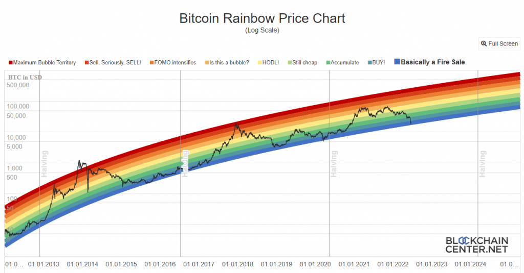
The chart shows the Bitcoin price on a log scale with the famous rainbow color bands(you may notice that even back then, indigo was missing). The legend only showed “Sell!”, “Average” and “Buy!”.
Notice how there is no “bow” in the “rainbow” chart, but more on that later.
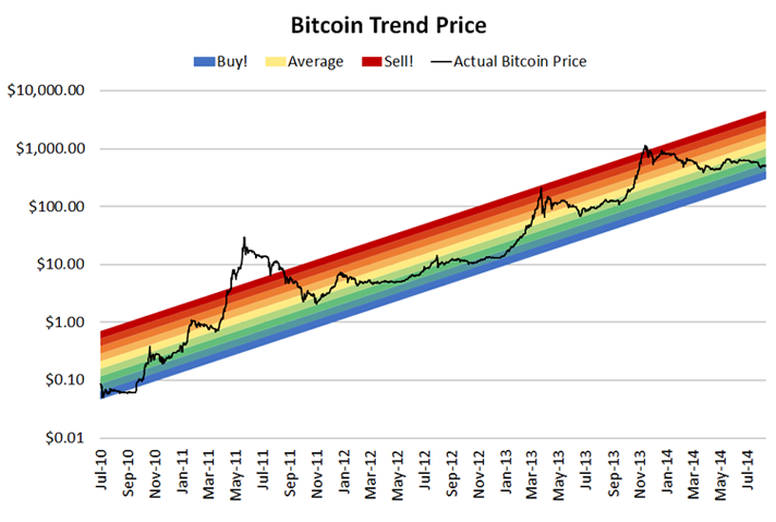
The log chart that he used, smoothed out the crazy volatility of Bitcoin at the time and made it possible to “see the bigger picture”.
And the color bands were a fun and easy way to to tell if the Bitcoin price is supposed to be “undervalued” or “overvalued”.
The rainbow charts that he posted were a hit in the community. They boosted morale and even though almost everyone knew that you can’t predict the price of Bitcoin with the rainbow everyone secretly thought “but what if?”.
The rainbow chart gave us hope in times of depressing price action (despite significant Bitcoin adoption progress!).
Over the coming months Azop proceeded to post his Bitcoin Rainbow from time to time in the form of an image in the “Daily discussions” on /r/Bitcoin. He called it “Azop stability and trend-line/rainbow charts for today.“. Here is a version that captured the absolute bottom in 2015 and the start of the 2016 rise:
At some point, two weeks before the bull run in 2017 was over, he completly stopped posting on reddit. No more rainbow charts! Here is the last known Rainbow chart from that era. As you can see he tweaked it multiple times to account for the new data and finally had to add the $100.000 mark to the y-axis:

A new dawn
Fast forward to the beginning of 2019. Again, we are in the middle of a brutal bear market with Bitcoin prices as low as $3.000 (from it’s $21.000 peak). Mainstream media is reporting Bitcoin dead (again!).
That’s when I remembered the Rainbow Chart and the “Hopium” it gave its observers. I decided that we needed an always up-to-date online version of the chart and started building it..
Only there was a huge problem. The Azop rainbow was a straight line! And on a log scale that means exponential growth. But as you all know exponential growth can’t go on forever which means the rainbow is destined to die at one point. In fact, if you would have taken the lower blue band from the last azop rainbow we would now (mid 2023) be at an “undervalued /fire sale” price way above $100.000. That didn’t make any sense. Nevertheless I posted the first live version of the Bitcoin Rainbow Chart on 2019-05-19 on Reddit (as a straight line). It became an instant hit with those who remembered. Some crypto news outlets even reported on it.
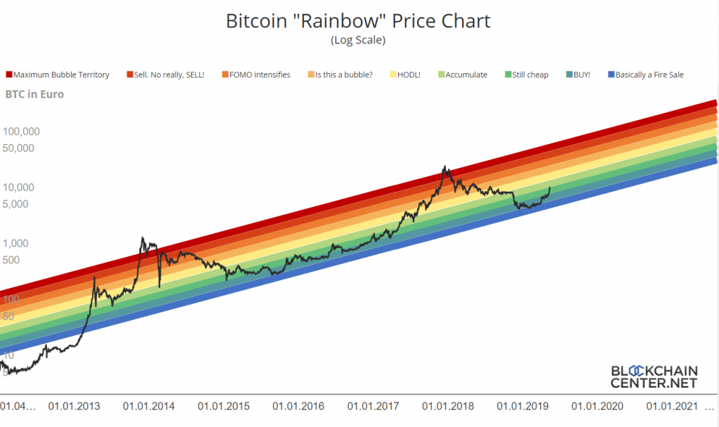
But the lack of a “bow” was a problem. Then I remembered another Hopium chart from the bear market in 2014 from Bitcoin Talk User trolololo. He used a more moderate and also more scientific way to model the Bitcoin price. He used a logaritmic regression, which basically means it would flatten out over time (at least on the logarithmic scale).
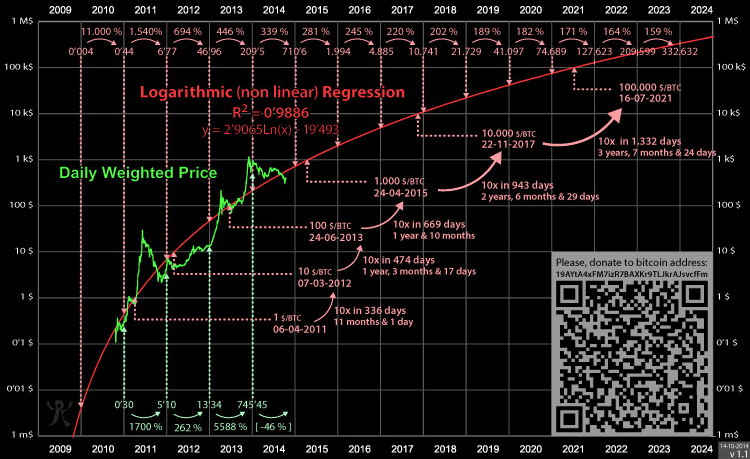
I took the y=2.9065ln(x)-19.493 formula and combined it with the rainbow chart. The new Bitcoin Rainbow Chart was born! trolololos line became one of the upper red bands of the new Rainbow Chart. I tweaked the width of the line and all the other colors to match the old rainbow chart and invented the new labels:

But except for some people on Reddit noone really knew about it. That changed in 2020 when Nic Carter & Eric Wall found my version of it (and probably remembered as well). Almost at the 2020 bottom (Bitcoin had just recovered from the Corona Crash) Eric tweeted a screenshot along with the hint to “Buy Bitcoin”. It became one of his most succesful Tweets and memed the Rainbow Chart back into existence with the new class of Bitcoiners that came after 2017. And it came at the right time….
The insanity of the Stock-to-Flow Charts
The rainbow chart was NEVER a serious attempt to model or predict the price of Bitcoin. Bitcoin. It was a fun way to look at the history(!) of the Bitcoin price. A meme, a joke, that nevertheless was kind of intriguing because we could say “it dates back to a formula from 2014 and it still holds”.
Enter PlanB, (Twitter Account @100trillionusd), an anonymous, seemingly senior investment valuation expert from a big bank in the Netherlands. In 2019 (after the rainbow chart!) he basically built his own curve based on the emission schedule of Bitcoin (Flow) and the amount of Bitcoin already in existence (Stock). On a log scale that also resulted in the distinct shape of the “bow”. He even used rainbow colors (even though I don’t think he was aware of the rainbow chart)!
![Wissen] Kann man mit Bitcoin noch reich werden? - Coin-Ratgeber.de](https://coin-ratgeber.de/wp-content/uploads/2019/11/stocktoflowbtc.png)
The difference was: He claimed his chart was based on a watertight scientific approach. He used complicated words like “cointegration” and supposedly high r-square values that should prove the statistical soundness of his model. He went on to go to every podcast on the planet, several big banks quoted him in their reasearch studies (most of which are now deleted by the way). And most Bitcoiners loved it! He amassed over a million followers on Twitter in a matter of months. All with the ridiculous assumption that the Bitcoin price was purely a function of the supply! The “model” completly disregarded the influence of the demand for Bitcoin. Also: He was adamant that based on his model we would reach $100.000 after the Bitcoin halving in 2020.
Luckily there were a couple of non-braindead Bitcoiners who called this charlatan out. Eric Wall was one of them and he used the Bitcoin Rainbow Chart to make fun of the Stock to Flow model. If a joke chart could predict the price of Bitcoin just as good (or bad) as a serious analyst clearly your model is crap.
The Rainbow Chart is dead – long live the Rainbow Chart
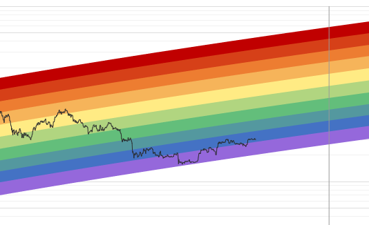
Everything was going according to plan. Yes, the chart did not come close to the red “maximum bubble territory” band at the cycle top in 2021, but even in the bear market in 2022 the Bitcoin Rainbow Chart seemed to hold. The Stock to Flow Model had already been invalidated by the way.
But in the following weeks the Bitcoin price dropped even more. At a price of below $20.000 it finally happened. With a small execption of the corona crash in 2020, after almost 8 years of the Bitcoin price always within the color bands, it broke…
I had never tweaked the rainbow before but now I had to make a decision: Should I let the rainbow chart die in dignity? Should I just wait? Or should I tweak the curve?
I decided to let it die. The joke was over. Also, I thought tweaking the formula of the chart would take away the magic of it.
Let’s just say people where not happy with that decision. So I compromised:
I left the formula for the curve as it was and just added another color. Indigo / violet was missing from a proper rainbow anyway! A couple of weeks later even the new indigo color did not seem to hold.
A new curve fit for the rainbow chart.
But even though it ultimately did hold, I realized, the old formula for the Rainbow Chart is too optimistic. The red color band already suggested a price of >$300.000 and even in the yellow band Bitcoin would need to be above $100K.
The old formula dates back to 2014 but with 9 more years of data I figured I could make a new, better curve. So 2022-11-21 I published the V2 Version of the Bitcoin Rainbow Chart: New formula, old colors.
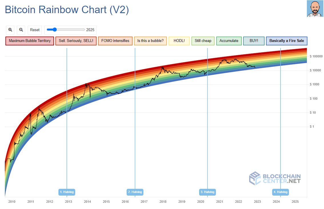
I have kept the old version online:
New Version: https://www.blockchaincenter.net/en/bitcoin-rainbow-chart/
Old Version: https://www.blockchaincenter.net/en/bitcoin-rainbow-chart-v1/
The rainbow chart is along with the Altcoin Season Index still the most visited page on blockchaincenter.net. With the new formula I hope there will be many more chapters in its history…